Since this week we need complete the task of several charts and maps, I just skipped to the latter part, chapter 5 and 10. Well, actually, they are selected to be the most important part. As a "lazybones", I did this short-cut.
Chapter 5 mainly talks about the basic principles of visualization, which focus on the arrangements of CHARTS. As a nature of human-being, we are more easily attracted by things of high color-saturation and dynamic state; that is, compared with numerical statistic and plain text description, video, infographic and picture are better at catching the eyeballs, which involve lower cognitive ability. Before we do the visualization, we should bear some rules in mind:
- MAKE SURE ABOUT THE THEME OF THE WHOLE PROJECT. The story we want to reveal through graphic forms, that is, "let the data speak."
- TRY DIFFERENT GRAPHIC FORMS. As trying different forms is to find out the appropriate one, but if it only depends on one person's opinion, it's not real appropriation. We should test our choices with others and get their feedback.
- ARRANGE THE COMPONENTS OF GRAPHIC. It needs some time and practices to get the feeling of how to build the relationship among graphics, how to make interactivity themselves.
These are bit similar to the 5W of Lasswell: WHO (the author) says WHAT (the theme or the information author covered) in WHICH channel (chosen graphic forms) to WHOM (Target audience) With what effect (Does this visualization make sense to the audience?).
Another useful reference is the scale of elementary perceptual tasks (p.128), a common rank of effect of ways visualization present on people who read it. It could be a great reference especially for novices, but we still need to think it twice before applying it, whatever how pervasive the method is.
There is a interesting data visualization of SELFIECITY, which random select tons of self-images from five cities on INS, which also includes the gender, pose and age, etc. We could take a look of certain group of people's selfies, like if I'm interested in selfies of females aged 23 from Sao Paulo, I just click on the left three graphics, and the rests will show the features of this certain group.

Turn into a series of charts, it looks like this:


2 images from selfiecity.net, by CFFC team.
Since there are various information crowed in the former, the team separated them in serval charts in a more detailed scale, which gives audience a clear explanation. Additionally, "Average Smile Scores" use a line instead of histogram, which made it simply beautiful.
Chapter 10 gives a view of thematic maps and choropleth maps. Some basic knowledge of map goes ahead before entering into these two. As there will be distortion when we turn spherical Earth into a flat one, we need to choose the right type of maps depending on the area we investigate. The project suggestion in p.269 is handy enough to get us up and run. What I impressed is that the particular rules for the choice of map, as I never paid attention but should keep in mind now.
For thematic maps, there are two key points we should be careful about. First is PROPORTION. If we plot circle or whatever shape occupied area, we should remember that its unit is square, not the length. The other is SYMBOL PLACEMENT. Usually, we put the symbol on the center of the area, while if they overlap too much, we could: put smaller one on the bigger -> change them to semitransparent -> scale down in proportion.
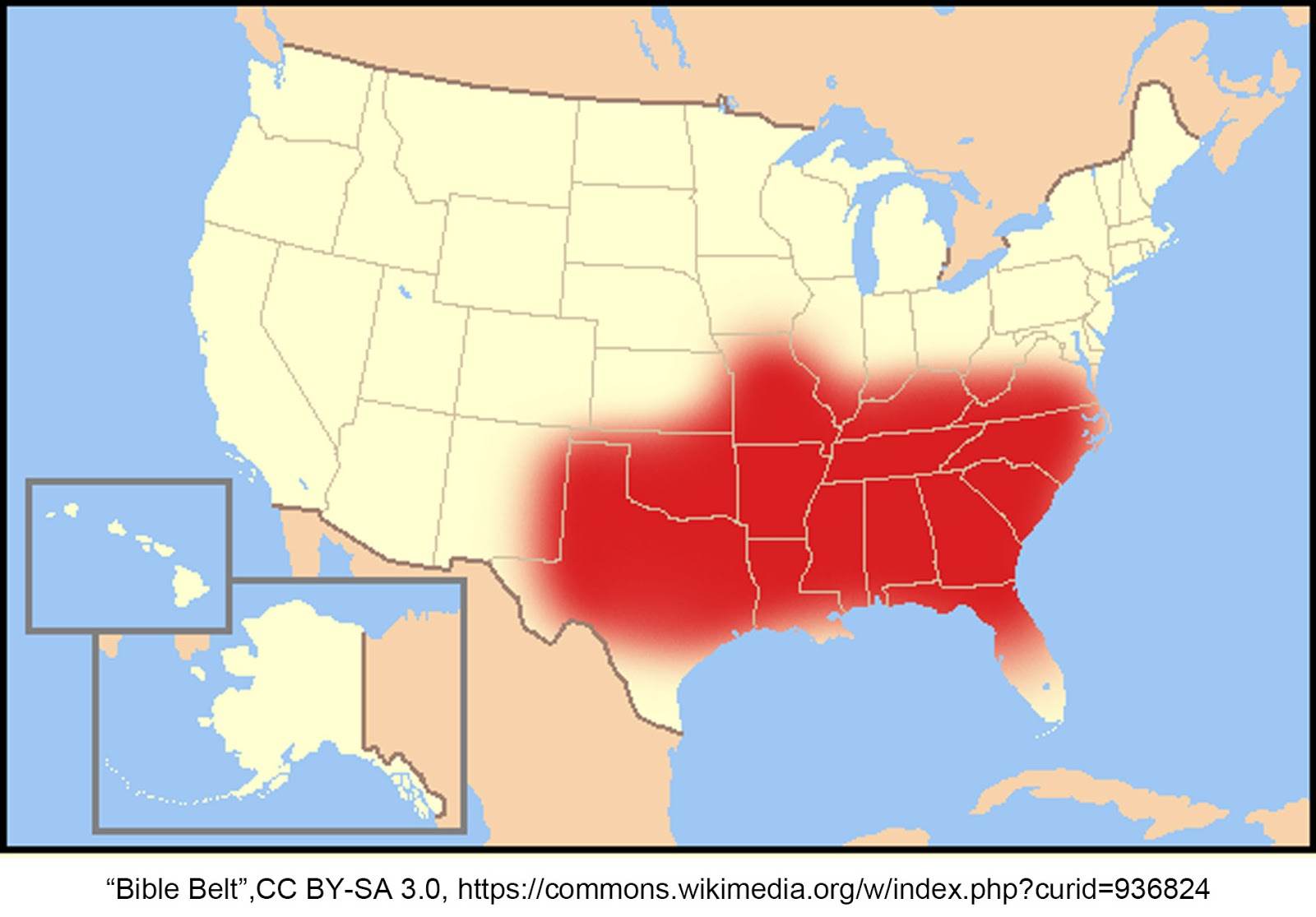
When considering choropleth maps, intervals of constant size is quite significant.
In the second map, the intervals of constant size are not equal, which are 10, 15 and 25 (%). Though We could get a closer look of the "Bible Belt" of the first map, it will be much better if it could give footnotes for why choose 10 and 25 (%) as breaks. (I guess 10% is the percentage of Baptists in US, 25% might be a high percent.) Or if we want to have a general vision of population of Baptists in US, we might need to change the form (e.g. cartogram) for archiving the balance between size of regions and population density.
|


Comments
Post a Comment